Visual Decision Tools
What are they?
Visual decision tools are used to represent decisions in graphical form. When you consider that many people like to see the big picture, or get a clear image in their mind, or like to have things in black and white, it makes sense that there would be visual tools for these decision makers.
The pros and cons
Before we get to the tools themselves, let's consider the uses and limitations of representing information graphically.
A picture paints a thousand words, as they say. It allows the viewer to go beyond the 'one-thing-after-another' nature of verbal language. When all the information is presented together in one go, it is easier to notice patterns and detect trends. It allows for the creation of new ideas, insights and considerations and may even give rise to new directions.
And at the same time it's important to remember that any visual representation is only as useful as the information used in it. We all know how graphs and charts can be used to give misleading results. For example, the scale used in a bar chart will determine the relative sizes of the individual bars.
Categories
Visual decision tools can be divided into two broad categories. There are those that are specifically designed to be represented visually, and those that are not, but can be represented visually anyway. Both groups consist of rational decision making models because they typically involve comparison and analysis.
Visual decision tools
- Decision Matrix
- Paired Comparison Analysis
- PMI Technique
- Decision Trees
- Decision Rings
Decision Matrix or Grid / Pugh Matrix
A decision matrix is a chart with the options on one axis and the important criteria on the other. These criteria are ranked for importance and each option is scored against each criterion.
Mapping it out on a chart makes it easy to sum up the benefits and work out the most useful option.
Paired Comparison Analysis
To use this visual decision tool write each option along the X and the Y axis of a chart. Each one is then compared with the others. Obviously it is unnecessary to compare an option with itself, and duplicate cells are ignored.
Each option is scored against every other one and the highest 'wins'.
PMI
Plus/Minus/Interesting is a complex version of simply scoring the positives and negatives. A third column, 'Interesting' is included and it's contents scored and added to the other 2 to get the final result.
Should I take the new job?
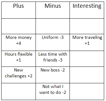
A total of -2 suggests not to go for the job.
Decision Trees
Decision trees are unlike the above examples in that a sequence of possible events is charted first. Only then are numerical values assigned, either financial values or probabilities.
Excel spreadsheets and a variety of software programs can be used to draw such charts. The humble pencil and paper work well for these, too!
Decision Rings
These diagrams show the information of a decision tree but are marked out as concentric circles. Each of the options is assigned a portion of the 'pie' according to the probability of it's occurrence.
Each stage is represented by a ring, with later stages being drawn as outer rings. Outcomes of decisions and uncertainties can be labeled using different fonts to distinguish them.
And 'folding back' the tree, or working backwards to determine the likelihood/benefit of any endpoint, can be done by coloring in the various pieces of the rings with different colors.
To market or not?
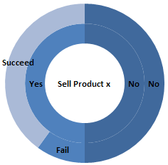
For this simple example, in selling product x, we can either begin to market it or not. If we do, we consider that there is an 80% chance of being successful and 20% chance of failure.
This visual decision tools advantage is that we have an overview of the whole situation, including a relationship between being successful and not even selling.
Decision rings do away with the need for precise numerical values. In complicated situations, they tend to look much less cluttered than trees. And benefits and risks are represented in a way that is easier to consider simultaneously.
Remember!
Simple risk/benefit analysis can also be represented visually by drawing two lists. Sometimes the fact of actually writing things out can simplify decision making. Not just because it is written but because in the act of writing, the actual decision to be made may be clarified.
And last but not least, remember 'Garbage In, Garbage Out' applies here as well. These are visual decision tools and it's vital to treat them as such. You will ultimately be responsible for making effective decisions. And the question you ask will determine the answers you get.
Like this page?
Mind Control
You have probably noticed that I am moving the whole Mind Control section to a new site. Please excuse any inconvenience.
This is the new site www.pschobegone.com. Feel free to come and visit. Any suggestions will be gratefully received!